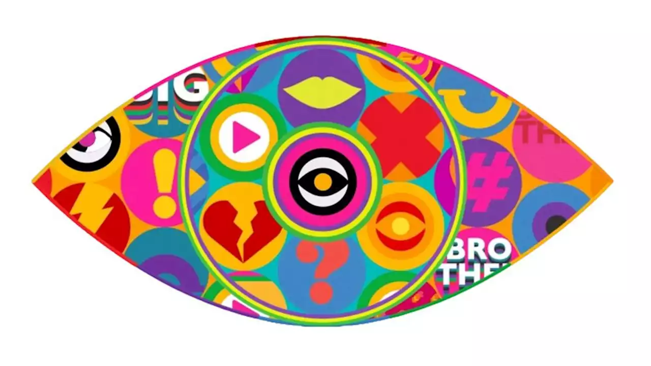
All seeing eye or chaotic eyesore?
How do you celebrate the 20th edition of a series that transformed television? How about with a logo that leaps off the screen with a chaotic explosion of colourful icons? Five years after Channel 5 ditched the series, ITV, the third UK broadcaster to own the rights to Big Brother, is rebooting the reality TV franchise for a 20th season.
The logo remains the all-seeing eye that has accompanied the series since its launch in 2000. But fans can't believe the new design is real. It features an eye within an eye and a whole bunch of garish icons. Perhaps it's intended to suggest that social media is the new surveillance, which would be kind of clever and timely, but fans aren't convinced.
The last 4 Big Brother eyes give me whiplash... from one extreme to the next every single time 😭 oh well maybe that means next years will be iconic? #BBUK pic.twitter.com/PetwDgiG8JHaven't watched Big Brother since 2008 but looking back at the history of the logos they were great designs, iconic. Just seen the new one for ITV aaaand...not so much. #BBUK pic.twitter.com/pNc1AobXHx"Is this the worst Big Brother eye ? Potentially.
