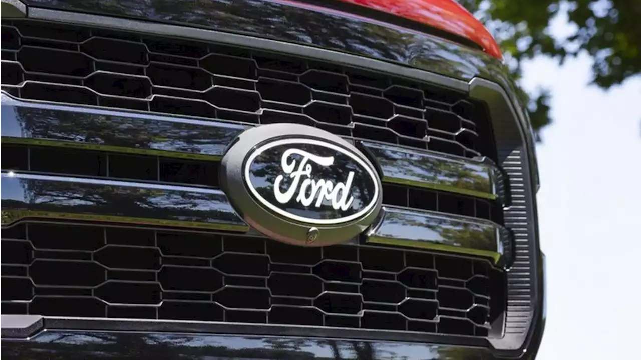
Can you spot the differences?
The new Ford badge retains the classic stylised Ford script that's been used in various forms since it was developed by the company’s first chief engineer, Childe Harold Wills, in 1909. The oval, first introduced in 1912, is also present and familiar.
But the design has been simplified, making it more similar to how it looked when it was reworked by the great designer The Chrome finish and out border have been replaced with simple white, and the inner border has been removed, allowing the text to be enlarged slightly to fill the space. The design doesn't constitute much of a surprise. In fact, it's perhaps more surprising that it took Ford so long to join the trend, which has seen a mixed response .
We have summarized this news so that you can read it quickly. If you are interested in the news, you can read the full text here. Read more:
