
Squid Game, beyond its dark narrative and violent games, demonstrates exceptional branding through its visual communication. This analysis explores the logo, iconography, and color choices that contribute to the series' iconic status and offer valuable lessons for brands seeking to create a cohesive and memorable identity.
Squid Game , a surprise hit when it first appeared on Netflix in 2021, is repeating that success with a second season. It maintains its tense and macabre atmosphere, but beyond the dark storyline and horrifyingly violent games, the striking visual design of the Korean series offers a surprising lesson in branding. While plot twists and strong characters undeniably contribute to the series' popularity, it's the clever use of visual communication that has propelled it to iconic status.
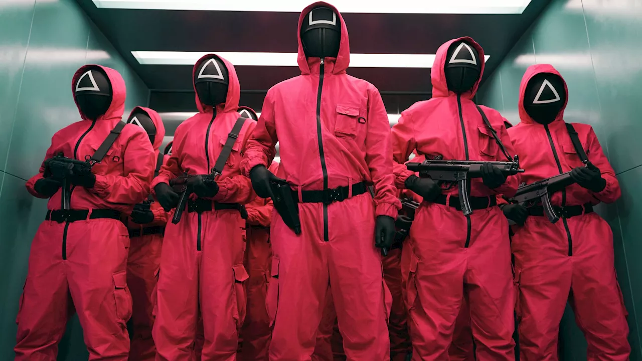
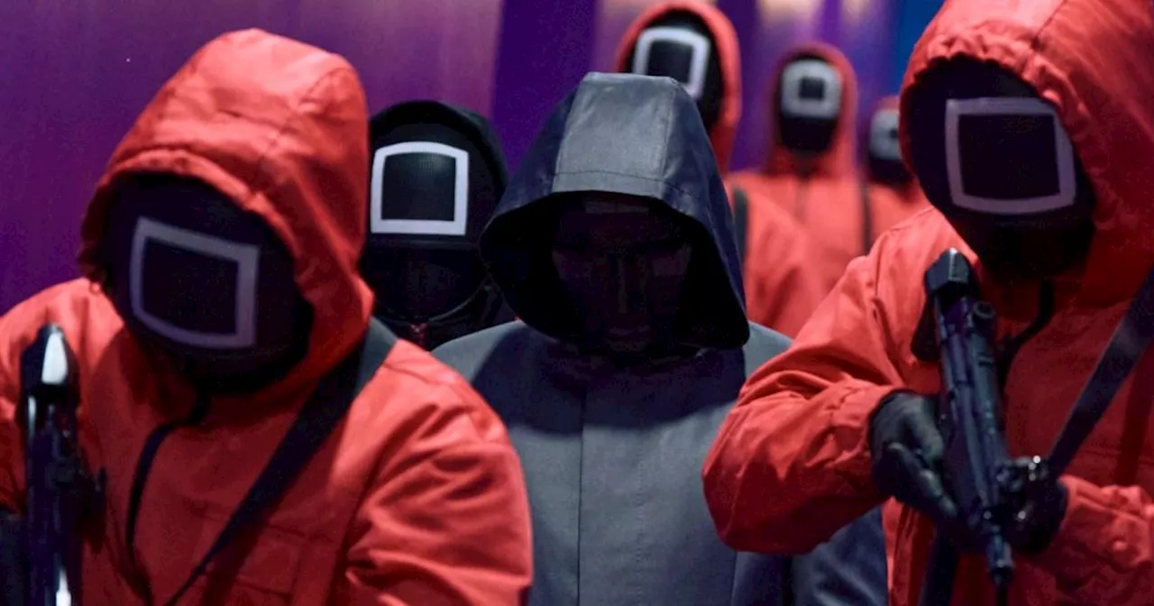
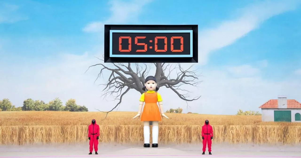
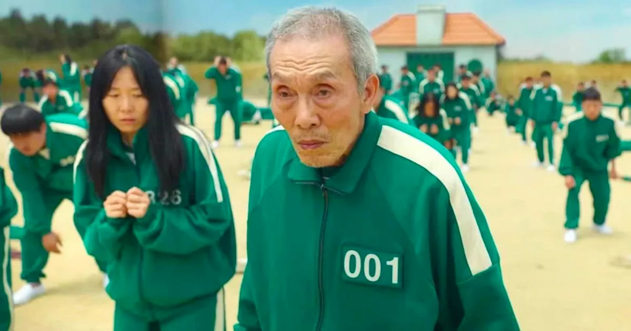
The series' branding strategy provides valuable insights for any brand seeking to create a cohesive identity. The Squid Game logo, whether in its original Korean or international translations, stands out as unique and distinct. Its angular letterforms and geometric shapes convey a sense of playfulness, futurism, and a hint of mystery, foreshadowing the series' themes. Elongated forms reflect the labyrinthine nature of the game world, and the pink/magenta geometric shapes represent the iconic game identifiers, connecting the logo to the onscreen color palette. The original Korean logo is particularly ingenious: the circle, triangle, and square icons are seamlessly integrated into the letterforms, allowing the series name to be abbreviated as 'OJM' (ㅇㅈㅁ). Regardless of the language, the logotype distinguishes itself from anything else on television, demonstrating the power of a bespoke typeface in establishing recognition and meaning. Speaking of icons, the circle, square, and triangle are recurring motifs throughout the series. Derived from the real South Korean children's game that inspired the series, these shapes appear everywhere, from the invitation cards to game set decor. They also serve to identify the hierarchy among the workers who manage the contestants: circles for lower-ranking workers, triangles for armed soldiers, and squares for managers. Inspired by worker ants, the creators used these simple symbols to dehumanize the workers while simultaneously communicating their distinct roles. The effectiveness of these symbols stems from their familiarity to a wide audience, even children, without compromising their distinctiveness. This showcases how a unique brand identity can be built from the simplest and most commonplace elements. The use of three icons adheres to the principle of 'omne trium perfectum,' suggesting that trios have a greater impact and lasting power. Squid Game also masterfully employs color in its branding, demonstrating the potency of simplicity. The uniforms and sets feature predominantly pink and teal, colors typically associated with children's games. Guards wear pink, a color often linked to childhood, femininity, and glamour, but here appropriated to convey danger. In contrast, the contestants' uniforms are teal. These colors permeate the sets and corridors, creating a stark visual contrast that not only delineates the 'good' and 'bad' characters but also establishes a bold and vibrant identity aligned with a brand inspired by childhood games.
Branding Visual Communication Squid Game Logo Design Color Psychology Iconography
United Kingdom Latest News, United Kingdom Headlines
Similar News:You can also read news stories similar to this one that we have collected from other news sources.
 Squid Game: Series Two Explores the Game's Dark OriginsSquid Game, the global phenomenon from South Korea, returns for a second season. Following the massive success of the first season, which captivated audiences with its deadly games and social commentary, the new series promises to delve deeper into the mysteries surrounding the game's creators and its impact on the world.
Read more »
 Squid Game season 2 ending explained as Player 001 changes the game completelyWhat happened at the end of Squid Game season 2? All you need to know as Player 001 changes the game completely. Warning – spoilers ahead!
Read more »
 Google Celebrates Squid Game Season 2 with Interactive Red Light, Green Light GameGoogle has created a fun Easter egg for fans of Squid Game, launching a mini-game based on the show's iconic 'Red Light, Green Light' challenge.
Read more »
 Octo Game 2: Experience the Thrills of Squid Game in FortniteA new Fortnite map inspired by Squid Game Season 2 immerses players in the high-stakes world of survival challenges.
Read more »
 Netflix's Squid Game Mobile Game Wins Over FansNetflix's launch of a free mobile game, Squid Game: Unleashed, tied to the popular show's second season has been met with widespread acclaim. Users praise the game for its seamless online multiplayer, cool upgrades, and faithful recreation of the Squid Game's intensity and challenges.
Read more »
 Squid Game: Unexpectedly Impressive Dubbing Surprises LatecomerDespite joining the Squid Game craze three years after its Netflix debut, the author found the English dubbing to be unexpectedly high quality, surpassing even expectations for the series' acting and storytelling.
Read more »