Antonia Wilson is a freelance writer and editor. Previous roles have included travel reporter for the Guardian, and staff writer for Creative Review magazine, alongside writing for The Observer, National Geographic Traveller, Essentialist and Eco-Age, among others.
As the world faced a second global war, among the politics and propaganda, the 1930s saw significant change in the way people communicated through design – particularly as the written word became increasingly important for governments to speak to the public. Alongside, there was an increase in advertising, the rise of modernism and the continued influence of
“Times New Roman began as a challenge, when type designer Stanley Morrison criticised The Times for being out-of-touch with modern typographical trends. So, The Times dared him to create something better,” Chris says. “Morrison enlisted the help of draftsman Victor Lardent and began conceptualising a new typeface with two goals in mind: efficiency – maximising the amount of type that would fit on a line and thus on a page – and readability.
Peignot was designed by A M Cassandre in 1937, after being commissioned by the French type foundry Deberny & Peignot. “It’s highly unusual, both playful and serious. There’s a lot of tension in the design, and you can sense how Cassandre was inspired by the world around him. You can feel the ripples of Bauhaus, with its aspiration to modernise and standardise shapes, getting rid of the lowercase.
“Memphis spearheaded an era of geometric slab serif typefaces that helped define the mid-century modern aesthetic,” says Riccardo de Franceschi, creative director at. “Slab serif design is a genre characterised by rectangular unbracketed serifs of a thickness comparable to the main strokes, and therefore are virtually monolinear. It is a genre introduced and popularised in the 1800s, alongside other expressive and novel display styles.
“I only discovered Euclid after reading about Craig Welsh and Elaine Lustig Cohen’s project to revive the typeface in 2016,” says Andy. “They developed the full set of glyphs from the 12 existing letterforms designed by Alvin Lustig in the 1930s. Renamed to Lustig Elements, a digital version has been released through P22 and it was cut as wood type by Hamilton for use in letterpress printing.”
United Kingdom Latest News, United Kingdom Headlines
Similar News:You can also read news stories similar to this one that we have collected from other news sources.
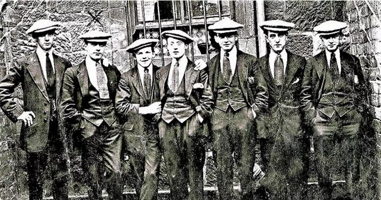 Glasgow's very own Peaky Blinders that dominated the city in the 1930sGlasgow's gangs wreaked havoc on the city in the early 30s when they were at their peak, with the City Council bringing in 'The Gangbuster' to wipe out the problem.
Read more »
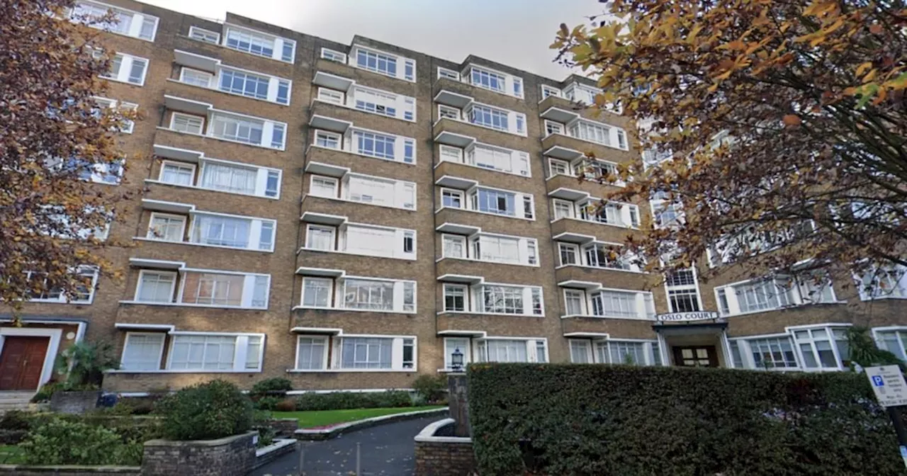 This 1930s block of flats has an incredible hidden feature insideOslo Court Restaurant, a family-run establishment in London, is described as 'stuck in a time warp' with its classic dishes, decor and service reminiscent of the 1980s.
Read more »
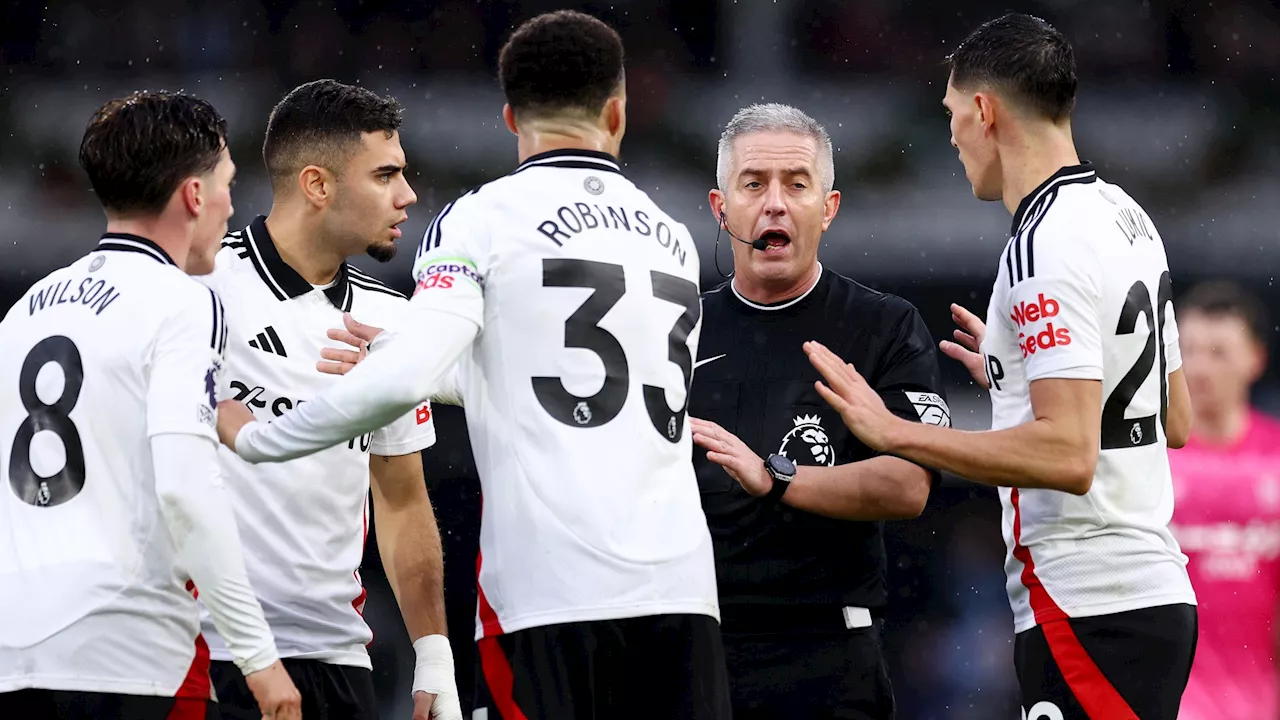 – Harry Wilson called out after reaction to huge penalty decision...Fulham troll Chelsea star Tosin Adarabioyo on TikTok after 2-1 win in the Premier League.
Read more »
 Lainey Wilson May Propose to Boyfriend Devlin 'Duck' HodgesCountry singer Lainey Wilson is ready to take the next step in her relationship with Devlin 'Duck' Hodges, but she's not waiting for him to propose. She's been open about her desire to get married and even hinted at proposing to him herself.
Read more »
 Yellowstone star Lainey Wilson reveals she may 'have to propose' to boyfriend Devlin 'Duck' HodgesLainey Wilson hilariously jokes about how she may 'have to propose' to her loving boyfriend Devlin 'Duck' Hodges after three years of dating in this video interview with Bunnie Xo on CMT's Instagram account.
Read more »
 Lainey Wilson Says She Might Have to Propose to Boyfriend Devlin 'Duck' HodgesCountry star Lainey Wilson is getting impatient about marriage and may have to take matters into her own hands if her boyfriend Devlin 'Duck' Hodges doesn't propose soon.
Read more »