Tom May is an award-winning journalist and editor specialising in design, photography and technology. Author of the Amazon #1 bestseller Great TED Talks: Creativity, published by Pavilion Books, Tom was previously editor of Professional Photography magazine, associate editor at Creative Bloq, and deputy editor at net magazine.
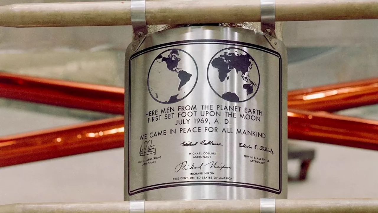
The 1960s was a time of both cultural and literal revolution, and design was by no means immune. This was a tumultous period inAs electronic phototypesetting emerged and modernist principles reached their peak, designers embraced both the limitations and possibilities of new tech and new ways of thinking.
"His minimalist approach to the structure of the letterforms is so pure," he adds."An exercise in how far you can strip back what makes a letter recognisable to the human eye. Like many, my first exposure to it was through Peter Saville and Brett Wickens' design for the cover of Substance by Joy Division – a combination that felt like a perfect match of being contemporary, unconventional and thought-provoking.
Influenced by industrial design with clean lines and balanced proportions, Eurostile is now regarded as Novarese's masterwork of geometric modernism. As Gianluca observes:"What makes Eurostile so special is its versatility. It can be used for everything from book covers to movie posters, from tech manuals to album art. It's a typeface that can be both serious and playful, classic and cutting-edge. Eurostile has even made its mark in pop culture.
This adaptability has been proven time and again, particularly in the world of music."From Radiohead and Metallica to Eminem and Tame Impala, Eurostile’s charm transcends genres, making it a staple in album artwork and band visuals. One of my favourite contemporary examples is Porto Rocha’s work for PAC NYC, which employs a custom typeface that echoes Eurostile’s timeless squareness and industrial elegance.
In the decades since, it's become a leviathan of the lettering world."A global sensation found on almost every continent, the letterforms have appealed to brands like Sandals and bands like NWA," explains Simon."If it's cool enough for Easy-E, it's cool enough for you. Still not convinced? Even Ryan Gosling sits next to it on the movie poster for Drive. Exactly. Like Ryan, Mistral is sexy AF.
This design system, featuring tightly spaced Times Modern Black in just two sizes centred at the top, would define the publisher's visual identity for over three decades. Plus its influence extended beyond publishing, later finding its way into fashion through its adaptation for the original Acne Jeans logo. For more on this lost typeface, read
United Kingdom Latest News, United Kingdom Headlines
Similar News:You can also read news stories similar to this one that we have collected from other news sources.
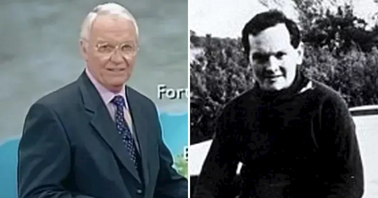 BBC legend Craig Rich who solved strange 1960s mystery dies aged 86Craig Rich, the BBC's first regional weather forecaster starting in 1978 who solved the mystery of Donald Crowhurst, has died aged 86.
Read more »
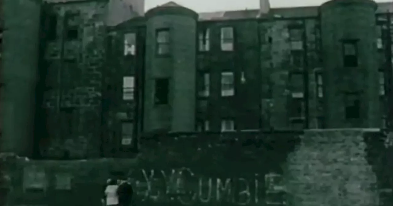 Resurfaced Glasgow documentary recalls 1960s street gangs that terrorised cityA documentary first shown in 1968 has been found online, featuring interviews with gang members as the city attempted to deal with a rise in violence.
Read more »
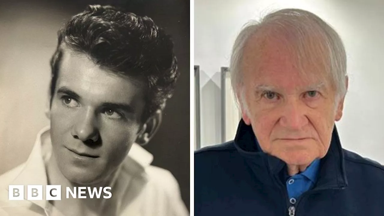 Bristol photographers mystery subjects revealed after exhibitionSome of the people Herbert Shergold photographed in the 1960s have come forward.
Read more »
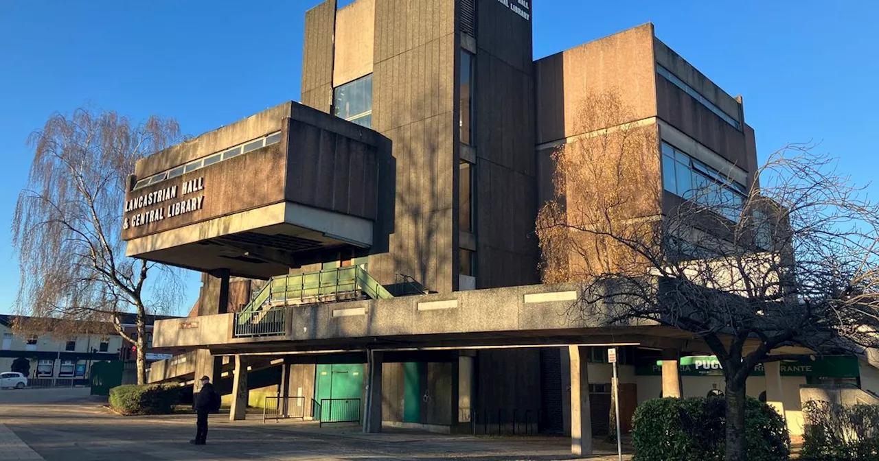 'It's a monstrosity, there's no need to keep it - it's holding our town back'The 1960s site has been empty for nearly 10 years
Read more »
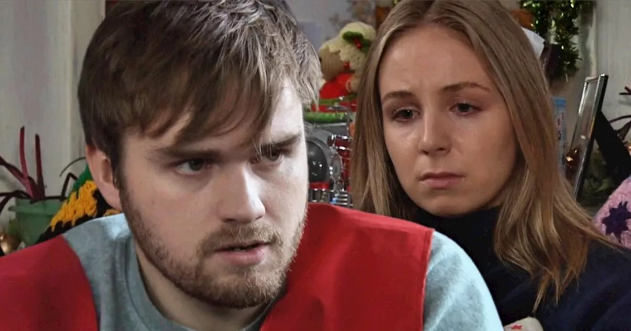 Emmerdale’s Tom King story not over yet as fears shared and answers demandedEmmerdale's Tom King may now be behind bars for his abuse of wife Belle Dingle, but the ITV soap has hinted the storyline may not be over just yet.
Read more »
 UFC 'trying everything' to agree superfight between Tom Aspinall and Jon JonesJon Jones recently admitted it would take 'f*** you money' for him to agree to a fight with Brit Tom Aspinall
Read more »