Westchester County's redesigned logo has drawn criticism for its resemblance to a dating app and its uninspired color palette. The new designs, intended to symbolize the county's community and progress, have been met with disapproval from residents and designers alike.
We've come to expect strong opinions from residents when a local government authority launches a new logo, but this redesign for Westchester County in New York State is getting criticised for a surprising reason. Some people think they've spotted an unfortunate resemblance to a very different brand. There are three new designs in total, and they're all being blasted for different reasons.
The old logo was hardly exciting, but the county government probably didn't expect the new design to be compared to a dating app. Westchester County needed an urgent rebrand because its old logo prominently displayed the county's '.com' domain, which it's been told to change to '.gov'. The result is a fleet of three new logos that sensibly avoid any reference to a domain name, but they're being criticised for other reasons. Authorities say the designs are intended to symbolise the county's interconnected community and its enduring commitment to innovation, natural beauty, and shared progress. But some people think the squiggle for the crossbar on the 'H' was taken directly from the dating app Hinge. Crossbar aside, the new logo's colour palette makes it look very boring for a dating app. 'Screams 'Westchester is boring and bland',' one person wrote on. 'It’s a poor logo that’s outdated before it’s out of the gate,' the graphic designer Marcy Rauch wrote, while someone else suggests it looks '80s/90s but not in a fun way.' Over on Things don't get any better with the two abbreviated logos, which use the acronym WCNY. 'It looks like an early 90s radio station logo,' one person writes. Indeed, it turns out that there is a PBS station called WCNY, which apparently has a good Bluegrass show on Sunday nights. Westchester County executive George Latimer has explained that the crossbar on the 'H' in the new logo is intended to represent a hook, symbolizing the fact that residents are 'linked by rail, road, and air. By culture. And most importantly, by choice
Westchester County Logo Dating App Criticism Design
United Kingdom Latest News, United Kingdom Headlines
Similar News:You can also read news stories similar to this one that we have collected from other news sources.
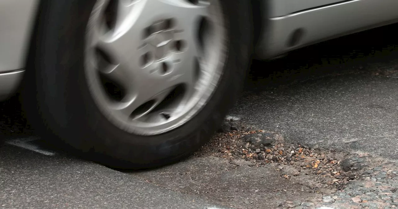 Lancashire County Council to spend extra £4.2m fixing county's roadsHowever it says that bringing all of Lancashire’s roads into good condition would cost more than £160million
Read more »
![]() Two new books examine the art of the logo, from corporate coherence to rock excessJonathan Bell has written for Wallpaper* magazine since 1999, covering everything from architecture and transport design to books, tech and graphic design. He is now the magazine’s Transport and Technology Editor. Jonathan has written and edited 15 books, including Concept Car Design, 21st Century House, and The New Modern House.
Two new books examine the art of the logo, from corporate coherence to rock excessJonathan Bell has written for Wallpaper* magazine since 1999, covering everything from architecture and transport design to books, tech and graphic design. He is now the magazine’s Transport and Technology Editor. Jonathan has written and edited 15 books, including Concept Car Design, 21st Century House, and The New Modern House.
Read more »
![]() Fans mock 'absolutely awful' new Six Nations logo created for 'younger audience'Rugby fans are united in their disdain for the new men's Six Nations logo, labelling it 'horrible', 'awful' and 'the ugliest thing I've ever seen'.
Fans mock 'absolutely awful' new Six Nations logo created for 'younger audience'Rugby fans are united in their disdain for the new men's Six Nations logo, labelling it 'horrible', 'awful' and 'the ugliest thing I've ever seen'.
Read more »
![]() The controversial new Six Nations logo is already burned into my irisJoe is a regular freelance journalist and editor at Creative Bloq. He writes news, features and buying guides and keeps track of the best equipment and software for creatives, from video editing programs to monitors and accessories.
The controversial new Six Nations logo is already burned into my irisJoe is a regular freelance journalist and editor at Creative Bloq. He writes news, features and buying guides and keeps track of the best equipment and software for creatives, from video editing programs to monitors and accessories.
Read more »
 A designer has 'fixed' the controversial new Jaguar logoJoe is a regular freelance journalist and editor at Creative Bloq. He writes news, features and buying guides and keeps track of the best equipment and software for creatives, from video editing programs to monitors and accessories.
Read more »
![]() Elon Musk defends missing Tesla logo on new Cybercab and CybertruckDaniel John is Design Editor at Creative Bloq. He reports on the worlds of design, branding and lifestyle tech, and has covered several industry events including Milan Design Week, OFFF Barcelona and Adobe Max in Los Angeles.
Elon Musk defends missing Tesla logo on new Cybercab and CybertruckDaniel John is Design Editor at Creative Bloq. He reports on the worlds of design, branding and lifestyle tech, and has covered several industry events including Milan Design Week, OFFF Barcelona and Adobe Max in Los Angeles.
Read more »