This article explores the history of the NFL logo, highlighting its transition from a 25-star design to the current eight-star configuration. It examines fan theories and speculations surrounding the reasons behind this visual change.
The NFL logo has undergone a significant transformation over the years, evolving from a 25-star design to its current eight-star configuration. While the league never officially disclosed the reasons behind this change, fans have speculated about the motivations. Some believe the simpler eight-star design was adopted for its ease of drawing and aesthetic appeal. Others suggest the reduction in stars aimed to create a cleaner and more modern look.
This shift in the logo's visual representation has sparked curiosity and debate among fans. Many were surprised to learn about the original 25-star design and its subsequent evolution. The 25-star logo, with its intricate pattern, stands in stark contrast to the streamlined eight-star shield that has become synonymous with the NFL. Ultimately, the reasons behind the logo's redesign remain somewhat elusive. However, the change has undeniably left a mark on the league's visual identity, prompting fans to ponder the story behind the transformation
United Kingdom Latest News, United Kingdom Headlines
Similar News:You can also read news stories similar to this one that we have collected from other news sources.
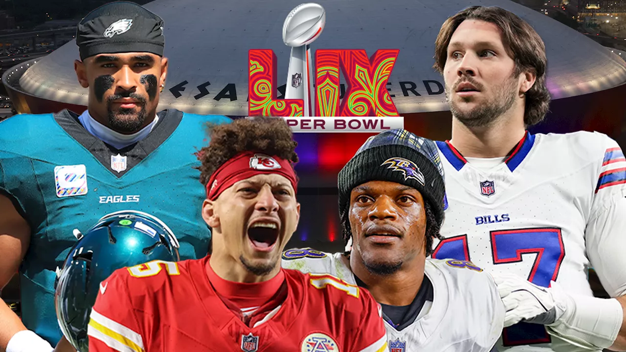 NFL Fans Conspire Over 'Leaked Playoff Script' and Super Bowl Logo ColorsSocial media users are at it again, spreading conspiracy theories about the NFL, including a 'leaked' playoff script for the upcoming season and the meaning behind the Super Bowl LIX logo.
Read more »
![]() The Most Read Logo and Rebrand Stories of 2024Creative Bloq takes a look back at the year's most popular logo and rebranding stories, highlighting the biggest changes from major companies like Audi, Collins, Jaguar, and Microsoft.
The Most Read Logo and Rebrand Stories of 2024Creative Bloq takes a look back at the year's most popular logo and rebranding stories, highlighting the biggest changes from major companies like Audi, Collins, Jaguar, and Microsoft.
Read more »
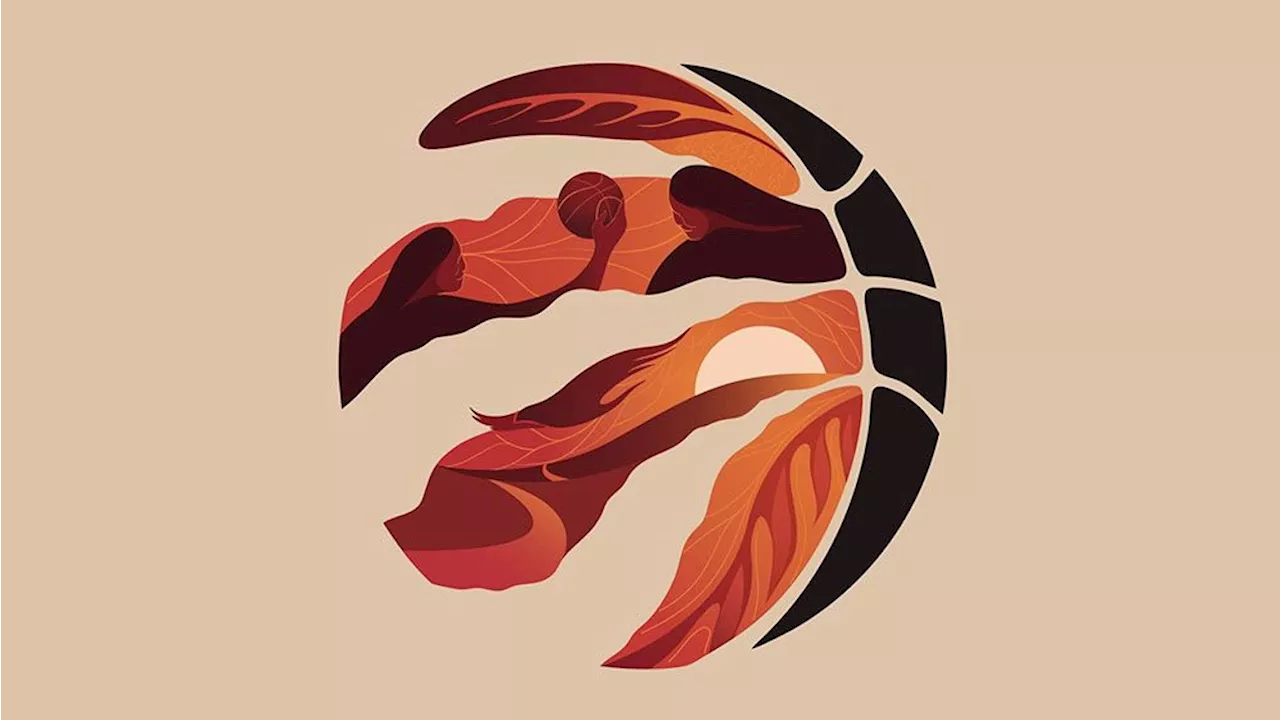 The Toronto Raptors' surprising special-edition logo is loaded with symbolismJoe is a regular freelance journalist and editor at Creative Bloq. He writes news, features and buying guides and keeps track of the best equipment and software for creatives, from video editing programs to monitors and accessories.
Read more »
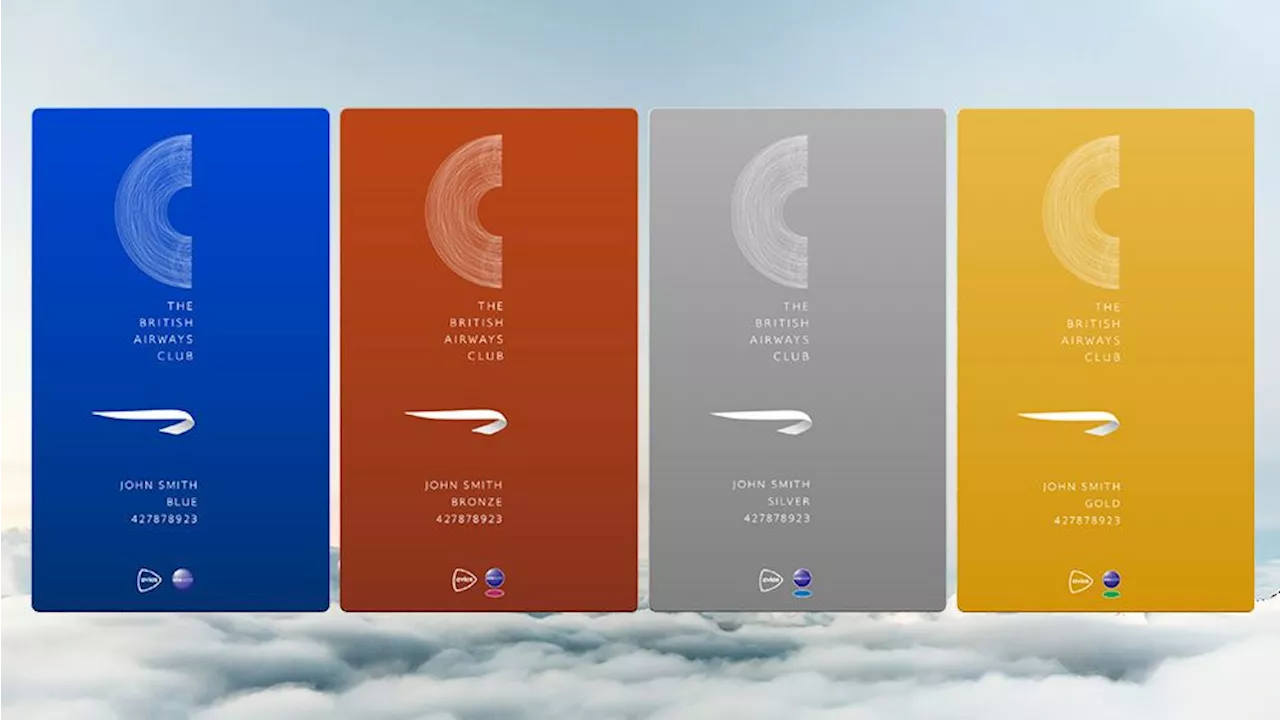 British Airways turns the hidden beauty of flight paths into a clever new logo designJoe is a regular freelance journalist and editor at Creative Bloq. He writes news, features and buying guides and keeps track of the best equipment and software for creatives, from video editing programs to monitors and accessories.
Read more »
![]() The new Microsoft Office logo could be the most confusing rebrand of the year (yes, already)Joe is a regular freelance journalist and editor at Creative Bloq. He writes news, features and buying guides and keeps track of the best equipment and software for creatives, from video editing programs to monitors and accessories.
The new Microsoft Office logo could be the most confusing rebrand of the year (yes, already)Joe is a regular freelance journalist and editor at Creative Bloq. He writes news, features and buying guides and keeps track of the best equipment and software for creatives, from video editing programs to monitors and accessories.
Read more »
![]() Sheffield Stan Shaw beer logo scrapped after knife complaintA member of the public complained to the alcohol regulator after seeing the logo at a Sheffield bar.
Sheffield Stan Shaw beer logo scrapped after knife complaintA member of the public complained to the alcohol regulator after seeing the logo at a Sheffield bar.
Read more »