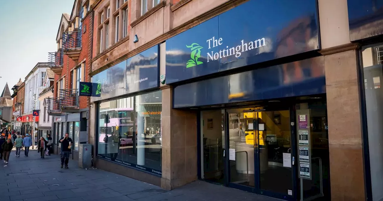
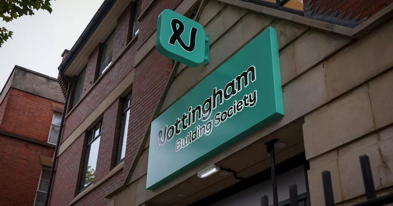
The Nottingham Building Society has unveiled a new logo as part of a rebranding effort, sparking mixed reactions from city residents. The iconic Robin Hood figure, previously featured prominently, has been removed from the updated design.
City residents have expressed their mixed feelings as The Nottingham building society has announced its logo change . As part of a rebrand, the company - now known as the Nottingham Building Society instead of The Nottingham - raised some brows when it revealed the city's iconic Robin Hood will no longer be part of the logo.
"For 175+ years, we’ve supported unique financial journeys and now we’re evolving to better meet your needs. Welcome to a different kind of society." A Beeston resident, Tracy Rushland, added: "I understand moving with the times but what was so outdated about Robin Hood? To me it just seems that money went down the drain because a logo change was not really needed."
"But is getting rid of Robin Hood from a logo really going to make that much of an impact? I think it’s doubtful and I don’t think people are going to care. It will probably just confuse people because they’re so used to the old logo."
Local News Robin Hood Logo Change Nottingham Building Society Rebrand Public Opinion
United Kingdom Latest News, United Kingdom Headlines
Similar News:You can also read news stories similar to this one that we have collected from other news sources.
 Nottingham Building Society Ditches Iconic Robin Hood Logo For 'Inclusivity'The Nottingham Building Society has unveiled a new brand identity, replacing its long-standing Robin Hood logo with a modern mint green design. The change, attributed to a desire for greater inclusivity, has sparked mixed reactions from members, with some expressing disappointment over the loss of the recognizable symbol.
Read more »
 Legendary folk hero Robin Hood axed from Nottingham Building Society logo in 'inclusive' rebrandNottingham Building society has carried out an ‘inclusive’ rebranding exercise - ditching its Robin Hood logo and changing its name.
Read more »
 Company's controversial rebranding seen at HQ as Robin Hood ditchedThe Nottingham Building Society said it had dropped its famous Robin Hood logo for 'inclusivity' reasons
Read more »
 City's own Robin Hood labels new building society logo as 'ridiculous'The man who plays Robin Hood around the city has hit back at logo change
Read more »
![]() Building society drops Robin Hood from logo for 'inclusivity' reasonsThe organisation wants to better reflect society as it is today but some members were less than impressed
Building society drops Robin Hood from logo for 'inclusivity' reasonsThe organisation wants to better reflect society as it is today but some members were less than impressed
Read more »
 The Nottingham Ditches Robin Hood For A 'Glow-Up'Nottingham building society ditches its historic Robin Hood logo for a modern, neon-colored aesthetic, sparking controversy among locals who view the change as a betrayal of the city's heritage.
Read more »